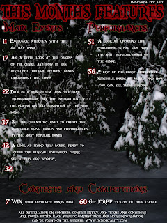
This is the initial design for my magazine contents page, it contains a few problems which i hope to remedy as time progresses, the most important being the text layout, and how certain titles are ridiculously proportioned, such as the "Competitions" at the lower point on the page. If i fail to sort the text out, i shall attempt to make the contents a double page, so as to create a more appropriately proportioned contents.
The background, however, goes well with the the front cover, as the both have snow ridden forestation featuring within them. The font for the "features", "Main articles", "competitions" and the numbers all are the same font and similar coloured to the magazine title.
 This is the second draft of my contents page, after experimenting with making it two pages, it proved a far more beneficial idea to create texts in columns and refine the information.
The "This months features" looks to have better colours, but still seems out of place in the page, i shall attempt to rectify this in my next draft.
There is also a big gap with nothing in it, which i have decided to place a picture in, so the contents page doesn't look too dull or uninformative.
 Added a more appropriate contents page introduction, added the picture for album artwork, amplified the looks of the titles, made them look more appropriate, modified text slightly and added a different colour scheme to the text at the lower parts of the page.
 Outer glows has been modified for each to add different amplification to each title.
The text needs modification and improvement, which i shall do for my final draft.
Here are the specific qualities of my contents page in more detail:

This is the main font of the page, it is in the font "Pieces of Eight" and has a red outer glow around it to emphasise it to the reader, and make it look slightly more appropriate for the magazine.
The specific text it uses is basically a slightly more appropriate and emphatic way of saying "contents" hopefully in a more unique way.
 The font used for the summary of the contents and the numbers are also in the "Pieces of Eight" font, and are all coloured white, the numbers of the pages which each article represents have a small red outer glow for emphasis, the background it is put on is more naturally coloured, in order to make it seem less bold. The white text is supposed to give off a cold feeling, similar to that of the picture used for the background.
The text has generic aspects to it, as well as its subject matter, as it is a page based on blunt information, it isn't as important to emphasize the genre of the magazine within the text, unless directly required to describe an article.
These fall under the columns of main events, and specifically relate to things which, through research, have been in magazines of a similar type.
No comments:
Post a Comment