Friday 4 February 2011

Evaluation: Question 7

Looking back at your preliminary task (the school magazine task), what do you feel you have learnt in the progression from it to full product?

My initial approach to creating a music magazine was lacking in specific qualities which i have developed when creating the final product; simple design, colour scheme, typecast and presentation abillities have been developed as the project progressed, and a much larger understanding on the aspects of a successful music magazine have been observed and taken into account.

The pictures used for the preliminary task were at a sub-standard quality, with little thought, editing and preperation taken into consideration; from my research I decided that for my final product I need to have a more unique and exploitable picture and background, which can be altered in order to help my product development and message.

I have learnt that there are specific qualities to each magazine which make it appealing and popular to the audience, such as a house style, and colour schemes, and have incorporated them into my final product, which will help it seem more geniune and professional, specifically my use of the colours Red, Black and Blue.

From my initial preliminary task, i have learned that it is important to appeal to the audience and adress them through the use of a cover model looking at the camera, as if to the audience, and poses should be natural yet more unique within throughout the magazine.

I found that it is a better idea to take pictures within a well lit room and to edit it into another specified background, as the lighting and poses can be worked on more easily, and the pictures contrast and specific shading can be altered in order to seem more natural with the background, I took my cover model's pictures indoors next to a white plain wall, and my backgrounds while outside in a local forest, and edited them accordingly in order to acheive the best results.

Drafting and creating a concept for my magazine greatly improved my management of time and rate of creation, it also allowed me to try out several different ideas before coming to a conclusive product design, which minimised the need to redraft and recreate my cover, contents and double page spread, and helped prevent problems during creation.

Time management was crucial for this task, my preliminary task was spent more on making an attractive front cover than producing a contents page, and thus didn't contain similar amounts of quality to one another, i decided to spend an equal amount of time on each part of my music magazine, and assure that they were all of similar quality, this also allowed me to make sure that the house style and colour scheme remained similar and in a pattern during its production.


This is an example, the top picture shows a badly pasted image, looking unnatural and peculiar with no interaction with the surrounding elements, it looks badly shaded and unaesthetically pleasing, whereas the bottom image shows a better edited, and more interactive model which works well with surrounding elements in order to provide a more natural and professional look, needed for my final product, but excusable in the context of my initial school magazine.

Evaluation: Question 6

What have you learnt about technologies from the process of constructing this product?

I have learnt the usefulness and productivity of using different technological equipment and programs throughout this project, i have learnt how to maximise the usefulness of a camera using equipment such as tripods, and learnt how to increase picture quality and usefulness using specific lighting and backgrounds, and exploiting them within Adobe Photoshop CS3.

Throughout the creation of this product, i have come to appreciate how technologies are used within the media in order to create products of a similar design, and how crucial they are in the editing and creating process of magazine development. Adobe programs being the most helpful of all used, as they helped me to create, design, organise, edit, process, and test my product efficiently and effectively.

My creativity was allowed to be used to its best of abillity, and creative boundaries which could not be acheived by many softwares were put into practice and created through Adobe Photoshop, which had a wide range of useful and experimental editing tools which aided in adding to my imagination and attitude towards designing and producing the magazine.

Blogger helped in the publishing of my product, as it was simple, had good user interface and allowed pictures and text to be created simple and efficiently, with a wide range of tools to personalise and produce it in a more attractive and simplistic way.

Photoshop CS3: Editing software for all my pictures, created the front page, contents page, and double page spread.

Blogger: Efficient way of publishing my work and presenting it effectively for people to see and mark.

MS paint: useful for copying screenshots needed to explain and provide more detailed information on aspects of my work.

Evaluation: Question 5

How did you attract/address your audience?

I spoke to my audience by appealing to their culture, and their level of mentality, as other magazines of the same genre and style have stated and proven is effective- creating a more mature and less obnoxious concept for the magazine, yet maintaining entertaining language, structure and jokes.

The magazine contents and front cover have many references to popular metal culture, and do not refer to them in a particularly childish or immature way, merely present them with as much information as possible. The line "Metalheads" is used frequently, and other terminology which can be read and acknowledged by the crowd are also used in order to successfully establish who my magazine is adressed too.

The metal fanbase are not just adressed in the text, but also the mise en scene of the picture used, and the models specific looks help to connote the concept of a metal based magazine, the long war trenchcoat, hair as well as the band t-shirt all provide links towards standard metal genre stereotypes, and can therefore be taken in by the intended audience in a much more positive light.

All the bands listed on the front cover are popular examples of bands in the selected genre of music that the magazine is trying to appeal too, and would help in its appeal towards a wide range of musically diverse readers.


Evaluation: Question 4

Who would be the audience for your media product?

Market research from other magazines shows that logically and commercially, my magazine should appeal to a mature male audience, as my chosen magazine's genre is that which draws an ageing male audience. The audience I am attempting to appeal too is of an age where large amounts of pictures and childish pictures and text are not in preference, and the written language is of a higher quality than that of other magazines, as well as any linguistic devices, such as jokes and wit. The potential readers of my magazine would be more interested in more mature content than in magazines of a similar genre representation, which i attempt to write in consideration of.

The musical preference of those reading my magazine would be that of Metal and its sub-genres, the television preference of the readers would probably be anything "original" or outside of modern popular culture, much like their musical preference. Their shopping patterns would probably revolve around food, backwater metal outlets and merchandise shops in the London area.

The most likely products which my target audience will be in preference of will be band and artist merchandise, and will probably by these from rare metal outlets or the internet.


Evaluation: Question 3

What kind of media institution might distribute your media product and why?

Logically, my magazine would be distributed by "Future Publishing" as they are the magazine in which mine is most similar too, in terms of design, genre and subject matter. They also show that they are interested in publishing products of similar design through their record of published magazines.

Although it is not fair to go under the assumption that they would want to endorse a product similar to that they have already, it would be logical to think they would be the best bet for interest and intelligent distribution.


Evaluation: Question 2

How does your media product represent particular social groups?


My magazine represents certain social groups by the people posing within it, and the references to the culture of the people who I am aiming my magazine at, the most important of these is the cover model for the magazine.

The two images presented share a great deal of aesthetic features. Posture is the primary element resembled in both; the two models both stand with their shoulders cast backwards, which is a trait common in the metal community, as it creates an air of both power and confidence. This pose is especially characteristic of metal vocalists, as it can be used to create harsh vocals which are often a significant musical element.

The arms of both models are folded around the diaphragm, further appealing to the power/confidence traits. Also, the chins of either model are raised, casting a shadow onto the eyes (a significant aesthetic feature in metal photography), and the hair is allowed to partially conceal a substantial amount of the face. The effect of this is to create a sense of mystery and of darkness. The chin of the model featured in my work is raised more so than the other, attempting to exaggerate the pose, reflecting harsher, more ‘metal’, musical style. The expression of either model is blank, bordering on disdain or passive aggressive. Both model sports a T-Shirt of another metal band, characterised by intricate logos and vulgar imagery; displaying support for other bands whilst broadcasting their own taste to the audience.

The angle of the shots is both head on, reflective of the direct nature and bluntness of the metal community. Any attempt to appear more artistic than is strictly necessary is likely to alienate the target audience. Lighting in both is low, distorting the black-dressed model with the background to create an eerie atmosphere. The location of my image is outdoors, whilst the other is inside, so I attempted to lower the brightness of my image to compensate. The magnification of my shot removes any features that make it distinctly outdoors, whilst the other image remains relatively untainted in this regard.

Evaluation: Question 1

In what ways does your media product use, develop or challenge forms and conventions of real media products?

My media product immediately resembles the magazine "Metal Hammer" as they both have similar layouts and house styles, and are both aimed at a target audience of mature males. Another trait which is common to both is the genre of music that they are representing, and targeting the fans of.

The first and most clear similarity between my front cover and the "Metal Hammer"is the choice of pictures, as they both share many specific qualities. Both pictures have a singular cover model, dominating the page, within a natural, snowy background and a dark colour scheme, with a clear house style. Both models are posing, and are dressed in clothing which would be appropriate for artists of the genre. The mise on scene of the "Metal Hammer" cover is much more effective and higher quality than mine, due to my lack of budget, but i could see that actual media products have sufficient funds to provide no creative barrier.

My Target audience is not of a childish age, and therefore my front cover is lacking in colloquialisms based on inpulsively catching someones eyes, my researched magazines also did this, but added a list of the bands within the magazine as the attractive impulse aspect of the cover, so as to attract so much attention from a variety of audiences.


This is a way of attracting a larger variety of audiences, and magazine, whether they are based on my genre or not- use it to full effectiveness, I have included one aswell. Real media products have shown that using a diverse colour scheme can be pro or counter productive, with my product, i made a lot of my typecast the same, but used colour variation to create a much more pleasing and easier to read end result. My house style is confirmed by the front page, and the colour scheme is dependant on the way the Front cover and contents page work together.

Simple editing tactics used
by the professionals I have adopted and incorporated into my final piece, for instance, the way that a person edited into a picture is used to block or go behind the main cover title, in order to look more or less natural.

The strapline to the main title is important in metal magazines, as it sets the scene or setting within the cover picture, Metal Hammer especially uses these to incorporate back stories of minor relevance into bands or artists, I have used it for the same effect.


The person i used for my magazine was important, I chose somebody who could dress and pose appropriately for the magazine front cover and spread, as he would be representing what the people of the genre desire in a band, i thought it appropriate to pick someone with the criterea of long hair, large build, and right for clothing prospects.

My Title font and style was chosen because of the way the text can be exploited, the fact that it can connote the concept of my genre effectively, and has more uses than in just the title, Metal Hammer and Kerrang use this method in order to show off their unique styles.


Thursday 27 January 2011

Magazine Double Page Spread: Finished


This is the completed double page spread, containing the finished article, picture, and accompanying extract, which many of my studied magazines used- the content is supposed to mimic that of other magazines in terms of standpoint and opinions, but has a unique element to it aswell.

Magazine Double Page Spread: Creation and Development

Using my research, I picked two pictures which could be effectively exploited for the double page spread of my magazine:


These two pictures i deemed appropriate for the double page spread, they were my choice because they are exploitable together, are both taken in landscape, and both of similar shading, the only problem will be the lighting colour, which i will edit out of the finished result.

Here is my first part of the double page spread design, the typecast and colour will be revised, as well as the shading of the background, however the picture edited well onto the background, and with modified inner shadow, was made to look more in-place and suited to the environment he is "in"

The right hand side will be dedicated to the font for the double page spread article.

Magazine Double Page Spread: Research


These are two magazin
e double page spreads which have both featured in the "Metal Hammer", but both have very different designs in terms of style and layout.
The picture on the left has a montage of pictures to accompany it, and captions for each, some text is amplified by colour, and several

Thursday 6 January 2011

Magazine Contents page: Finished


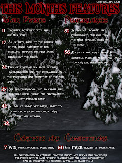
This is my finished design for the contents page, it uses similar font and style to the front cover, contains text related to the genre of music the magazine is representing, as well as related subject matter. The picture represents an album cover stereotypically featured within the genre (it was either pictures of forests, or burning churches) and the band names seem appropriate. Competitions are also shown but in less priority to the rest of the contents.

Magazine Contents page: Creation and development


This is the initial design for my magazine contents page, it contains a few problems which i hope to remedy as time progresses, the most important being the text layout, and how certain titles are ridiculously proportioned, such as the "Competitions" at the lower point on the page. If i fail to sort the text out, i shall attempt to make the contents a double page, so as to create a more appropriately proportioned contents.

The background, however, goes well with the the front cover, as the both have snow ridden forestation featuring within them. The font for the "features", "Main articles", "competitions" and the numbers all are the same font and similar coloured to the magazine title.


This is the second draft of my contents page, after experimenting with making it two pages, it proved a far more beneficial idea to create texts in columns and refine the information.

The "This months features" looks to have better colours, but still seems out of place in the page, i shall attempt to rectify this in my next draft.

There is also a big gap with nothing in it, which i have decided to place a picture in, so the contents page doesn't look too dull or uninformative.


Added a more appropriate contents page introduction, added the picture for album artwork, amplified the looks of the titles, made them look more appropriate, modified text slightly and added a different colour scheme to the text at the lower parts of the page.

Outer glows has been modified for each to add different amplification to each title.

The text needs modification and improvement, which i shall do for my final draft.


Here are the specific qualities of my contents page in more detail:


This is the main font of the page, it is in the font "Pieces of Eight" and has a red outer glow around it to emphasise it to the reader, and make it look slightly more appropriate for the magazine.
The specific text it uses is basically a slightly more appropriate and emphatic way of saying "contents" hopefully in a more unique way.


The font used for the summary of the contents and the numbers are also in the "Pieces of Eight" font, and are all coloured white, the numbers of the pages which each article represents have a small red outer glow for emphasis, the background it is put on is more naturally coloured, in order to make it seem less bold. The white text is supposed to give off a cold feeling, similar to that of the picture used for the background.

The text has generic aspects to it, as well as its subject matter, as it is a page based on blunt information, it isn't as important to emphasize the genre of the magazine within the text, unless directly required to describe an article.

These fall under the columns of main events, and specifically relate to things which, through research, have been in magazines of a similar type.


Magazine Contents page: Research and planning

Through my previous research of magazines, all of them share a similar traits which should be taken into consideration when designing my own, magazines representing all genres all follow similar rules, as well as certain specific aspects exclusive to magazines of my selected genre.

All magazines tend to not have colourful backgrounds (usually monochrome) in their contents pages and are usually accompanied by a picture, commonly representing the artist on the front, or specific merchandise related to them. The backgrounds are either monochrome, or contain an environmental scene similar or identical to that of the front cover.

The text used within these magazines are usually organized in three columns, and present the information in a way which is easily read, or seen by the audience. The article summary is usually twinned with a page number, and is presented to make it aesthetically pleasing to the eyes, with minimal colour contrast and strain.

Using this makeshift criterion when creating my contents page will help me to develop the design and create an effective and authentic looking contents page, which looks appropriate to the genre and accompany the picture used in my front cover.

Magazine front cover: Finished


This is the final design for my front cover, it uses many aspects which my researched magazines have, contains a variety of information, and is edited in a certain colour scheme and house style, which will be maintained throughout the magazine.

The three colours primarily used are Red, Black and various shades of blue, and these shall be maintained throughout the magazine accordingly. The colour is also in accordance with the picture used, and the two contrast well. The text has been made to stand out, and be perfectly clear with the picture using outer glows.

The magazine title has a large emphasised "I" followed by the "mmortality" in order for emphasis and more unique qualities, there are pictures relevant to the article mentioned, and containing the front covers "model" within them, substantiating their placement.

As with most magazines, there are a list of popular culture bands written on the front in order to attract a more mainstream and widespread musical audience, with varieties of likes.

There is a Lens flare in the eye of the person, and is used to emphasise the picture, add strange or unique qualities to it, and make the statement or accompanying text create an atmosphere like that of more "metal" style set up, as the picture itself connotes little towards genre appealing.

EDIT: CONTRAST TO BE SORTED

Magazine front cover: Development and design


Here is the picture and
background i shall be using for my front cover, they are edited onto each other, and will be edited to look more natural as the front page progresses.


This is my initial Design for the front cover, it has the Title in the selected font, A bar code, an appropriate tagline, and a background image of someone looking at the audience while in a snowy woodland scene. There are many contrast effects on the Background image, and the image imported into the picture, in order to make them look more natural, although dark and mysterious, so as to help my magazines intented genre appeal, as other magazines have proven with this.

I have used inner shadow to create a slightly more natural look of the placement of the person within the background.


This is my improved design, it had better shading of the person against the background, contains text of summaries which would be considered appropriate and relevant to the magazine, added a lens flare in the eye of the "model" and added the line "A glint in the eye" under the shading from "Out of the Darkness" in order to provide relevance to the picture, and keep it marginally mysterious.

The Line "I'm Watching you" is put behind the person, adressing the audience with little subtlety, i will revise the font and usage of it for my finished design. I will probably add more content to the right hand side of the cover, preferably involving pictures.


This is the third design, its the same as the second, with an addition of a list of popular bands within my chosen genre, something which many magazines often do on the covers, to appeal to less specific audiences.


Pictures will be added to the right on my final draft.

Magazine front cover: Pictures and choices

These are a selection of pictures and backgrounds which i put into consideration for use in the front cover.


These three pictures are the better looking of a group of pictures taken of each person, for possible use in the front cover, these could be easily and successfully exploited into a background more suitable, and will put into consideration for use.


These are some of the backgrounds i intent to choose from for my front cover, they portray a more appropriate scene in which my magazines main article will be based, and a better background for my chosen picture.

Pictures with inappropria
te backgrounds can still be put into consideration, as i intend to edit any problems within pictures if they are selected.

Magazine front cover: Initial plan

The initial design for my magazine front cover should have similarities to that of magazines promoting the same genre of music as mine theoretically is, and therefore certain design aspects from these should be recreated and used in my magazine. For my front page to be realistic and similar in design to actual music magazines of my selected genre, i created a list of specific qualities used in all the magazines i researched, most of which can be seen in the Metal Hammer magazine research i have done previously.

The research on Metal Hammer can be seen here: Link

Here is the list of qualities i shall need for my magazine front cover:

Realistic or natural environments for the background of the front cover's picture.
Somewhat interesting or diverse clothing or poses made by the person/people in the picture.
Short and memorable tag-line accompanying the main picture to add emphasis.
A title which is manipulated to its surroundings (probably will not be incorporated into my magazine)
Emphasis on the picture more than the writing.

Other features, such as the presentation of the articles featured and other pictures shall be explained and elaborated upon later.


Monday 3 January 2011

Double page spread content- Draft

“A life in solitude unearths and amplifies emotions, and helps me to represent them through my work.”

After traveling for miles through Icelandic forests just to meet this one man, I could only describe my anticipation for meeting him as unbearable. Needless to say, I expected a man living in such solitude to have a certainly remarkable personality, or at least an interesting one.

He’s dressed from head to toe in black, his eyes vacant, almost as if they’re fixated on a point beyond my consciousness, his long hair stained with dirt from the forest wraps around his neck menacingly, and his mouth tightly shut. I look at him, trying to get his attention, but his eyes remain dormant and fixed. He gave off the impression of being vacant or uncaring towards my presence; I open my mouth to begin asking him my first question before his head snaps round to look at me and he beckons me to be keeping silent.

He remains motionless for what seems like minutes, before slowly raising his hands up towards the sky and quietly saying “Tranquility and awareness come from within the forest, separation from the conventional world allows connection with previously self concealed emotion, my work is more than the sound of a guitar, the beat of a drum and the scrape of a violin, it is an expression of my inner feelings and ideas.”

Lowering his arms, he smiles lightly and leans towards me, and quietly but with a jovial tone says “It’s cheap too.”

As he leans back, I feel comfortable enough to start asking him questions; he nods as if to tell me it's fine, so I begin.

“When did you first start writing music?”

“Well, that’s the same as asking me how long I have been expressing my emotions for, which I can say has been forever. As my first album "De-fo-rustration" exemplifies, my music has been primarily personal and unique depending on my moods. Music has been within me since birth, and as soon as I could put it into practice, I’ve lived through that idea.”

“Who or what is your musical inspiration?”

“As I said, my emotions are the sole inspiration for the music I write, but living alone within the depths of the forest helps to provoke denser emotions, a life in solitude unearths and amplifies emotions, and helps me to represent them through my work, so I’d suppose my environment is also an important aspect of my work.”

“What provoked you live out in the wilderness?”

“I feel like a part of nature out here, there are no rules, regulations or constraints. My undying love for nature comes from its simplicity and perfection, out in the forest, there are no doubts or societal chains, just personal peace and comfort, where i can be who i want to be without the constraints of others. I sometimes look at the trees and plants for hours, days even, just to watch them grow, insane as I may be, I have reached a state of personal awareness and tranquility that exceeds beyond that of all the men and women in the industrial world outside, hell. it also allows me to escape my fans since all the recent popularity.”

“Are you going to release a new album in the near future?”

“It is my full intention to once again unleash my emotions unto the world through musical format again; however, I am a lot different to before, my emotions have changed since my last album, so my work will be a lot more different and varied.”

"What other plans do you have for the future?"

"I intend to create a unique and interesting new style for the genre, different from anything
heard from others, and it shall reign supreme of all other genres and bands, leaving nothing but emotive and powerful music for the masses, my new albums will push the limits as to what one man can do, but i intend to prove that it's possible to produce amazing work with just one mans determination and skills."

"What led you up to this current living style?"

"Look around you! The beauty! The solitude! It's a sanctum for tortured souls. The outside world is but an echo in my mind, I've escaped stress, negative desires and all the troubles of a "normal" person, and I was a normal person, with a normal life until a few years ago, i decided the world was full of unnecessary elements, and that a life out here would destroy them. I was right. To write and appreciate music like mine, you must be able to understand how the way I live helps."

"Do you ever do any live performances?"

"I play live all the time- the forest as my audience, and the rustling leaves are my crowds. I occasionally venture out into civilization play for the people of the local village, and when i do, the whole place becomes a vesicle for my creativity, and a being of its own. Live performances by a schedule are horrible ideas, they force talent away from the performers, it's horrible to think of myself doing that."